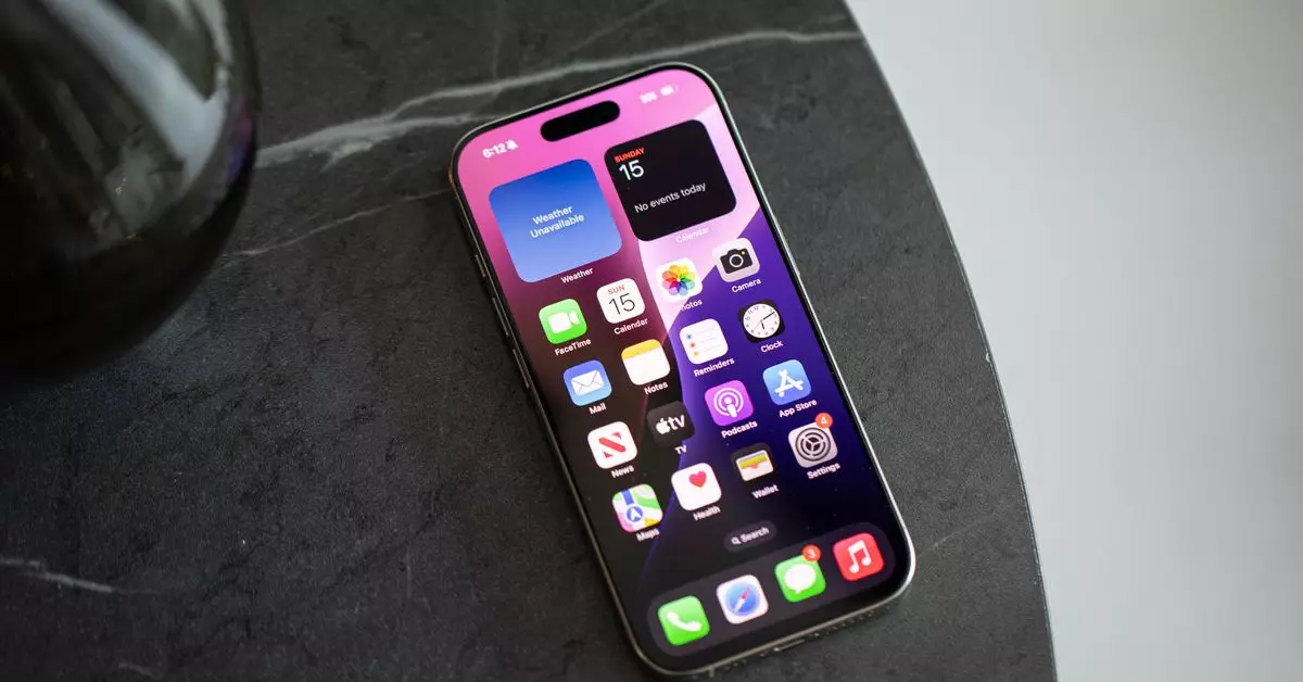
In an era dominated by endless notifications and app overload, many smartphone users have faced a common dilemma: the traditional app grid, once a sanctuary of organization, has begun to resemble a chaotic mess. As someone who has navigated through multiple smartphones over the past decade, I too have felt the weight of those familiar app icons, each vying for my undivided attention. This feeling of oppression underscores the notion that as our digital lives expand, so too does our need for a more serene and curated mobile experience.
For so long, the grid served as the primary method of app organization, especially within the confines of iOS. Its utility was clear, particularly when users had a conservative number of applications. However, as we accumulate more apps—over sixty in my case—the grid becomes increasingly crowded, leading to visual fatigue. This square-format perspective might suit those with a handful of applications, but for the modern user, it can feel suffocating. Meanwhile, Android users have had the luxury of utilizing an app drawer, granting them the freedom to liberate their home screens from the shackles of relentless icon visibility.
With the introduction of iOS 14, a glimmer of hope appeared for tired iPhone users. Features such as widgets and the app library offered a refreshing alternative to the previously rigid structure. iOS 18 has further advanced this flexibility, allowing users to spread apps and widgets freely across their screens, as well as customize their appearance. Despite these enhancements, many individuals—including myself—initially hesitated to let go of the conventional structure we’ve known for years.
This hesitation raises an important question: how do we transition from a grid-based mentality to a more flexible, personalized environment? Motivation often stems from both necessity and realization. As I dove into this redesign of my digital world, I recognized that my homescreen was not just a backdrop; it was a reflection of my needs and habits. I pondered the necessity of every app displayed at all times. Did each icon justify occupying that limited screen real estate?
Taking on the task of cleaning up my homescreen was a transformative experience. I dedicated an hour to streamline my digital workspace—deleting dormant apps and replacing them with purposeful widgets. Through this process, I discovered an intriguing balance between functionality and minimalism. For example, in my updated layout, only four essential apps remained docked, while widgets now adorned my two-screen setup. I publicly dubbed this new arrangement my “Windows Phone 2.0,” a playful nod to the evolution of mobile design.
The anxiety of stepping away from the grid was palpable. However, the reality of this minimalist approach quickly became liberating; I found myself less distracted by notification badges and cluttered icons. The iPhone’s Siri suggestions and the search function became indispensable allies, allowing me to locate apps with minimal effort. Dismissing notifications offers its own challenges, yet the reduction of visual temptations on my home screen significantly improved my focus.
Conversations with colleagues shed light on varying methodologies for taming digital chaos. Some, like Wes Davis, have mastered the art of functional layouts. His strategy involves a blend of shortcuts and select apps to minimize distractions. By employing grayscale shortcut icons and organized shortcuts, he boasts a highly functional system, one which allows immediate access to necessary tasks without the allure of time-consuming apps leading him astray.
Jay Peters, on the other hand, prefers a simplified approach, maintaining only seven apps on his home screen, adjusting them based on temporary needs. Each perspective, though distinct, shares a common goal: a reduction in digital clutter.
Despite many of our peers still adhering to the classic app grid, there is an overarching shift towards streamlined digital engagement. An increasing number are favoring search functions over traditional browsing through app icons, pointing to an evolving understanding of efficiency in the digital realm.
What emerges from this collective quest for clarity is a promising horizon. As iPhone users gradually adapt to advanced customization and functional layouts, the path leads toward a new paradigm in which technology serves our needs, rather than dictating them. This evolution demonstrates that we do not necessarily need to wait for sophisticated AI or novel computing paradigms to alleviate the nuisances of digital clutter.
The journey toward a redefined, personalized mobile experience ushers in an era of intention-driven organization—illustrating that as technology continues to evolve, so too must our strategies for navigating its complexities. By embracing a minimalist mindset, we can successfully transform our digital lives into less distracting, more efficient landscapes, ultimately leading to enhanced productivity and clarity in our everyday tasks.

