Apple’s unveiling of the Liquid Glass design for iOS 26 at the WWDC 2025 has been met with a mixed bag of excitement and skepticism. This new aesthetic, which promises a fresher and more fluid user experience, signals Apple’s ambitious attempt to reinvent the look and feel of its software interface. Yet, despite the innovative premise behind Liquid Glass, there are significant concerns regarding its practicality and user-friendliness that need to be addressed.
The Aesthetics of Transparency and Floatiness
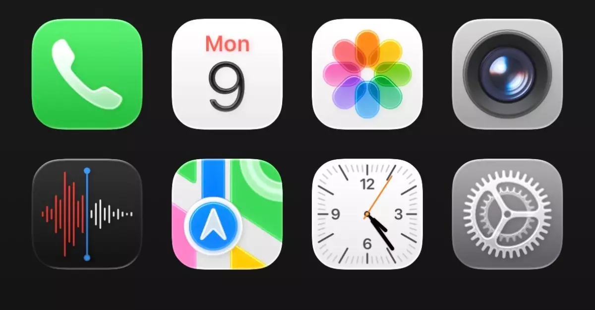
Central to Liquid Glass is its translucent quality. Apple’s design philosophy appears to emphasize depth by allowing app icons and interface elements to appear as if they are floating over the device’s wallpaper. While this fresh use of transparency can create a visually stunning environment, it also raises practical questions about usability. As users navigate the more ethereal icons and tab bars, the excitement can quickly morph into frustration when the interface becomes cluttered. This design language may be eye-catching, but it also risks obscuring the very information it seeks to highlight.
Imagine trying to read a text conversation against a complex, dynamic background; clarity suffers in favor of aesthetics. In my experience with the iOS 26 developer beta, this dilemma was palpable. Every glance at my homescreen revealed a medley of colors and bubbling icons, but not all of these elements were harmoniously integrated. For the everyday user, such a disconnect could lead to confusion and distraction, which contradicts Apple’s long-standing reputation for intuitive design.
Functionality Versus Form
While the Liquid Glass design shines visually, it also raises ergonomic concerns—particularly in the Control Center and various apps like the Clock function. One notable effect of this fluid aesthetics is its impact on usability. Optics aside, when interacting with controls obscured by transparency, the efficiency of user interactions can come into play. Critiques regarding the overwhelming clutter of options in the Control Center are warranted. Instead of offering quick access, it appears muddled and overwhelming, failing to adhere to the user-friendly principle Apple has championed over the years.
Moreover, the unorthodox oval shapes replacing traditional circular buttons raises additional usability questions. Are these aesthetic tweaks truly improving functionality, or do they simply serve to create a superficial visual impact? Apple cannot afford to overlook the balance between functionality and form—users overwhelmingly value the effectiveness of interacting with their devices above their superficial presentation.
Early Impressions and Room for Refinement
Initially, my response to Liquid Glass was one of hesitance and skepticism. Apple’s history of ambitious UI reforms provides a backdrop for my concern, as early iterations have at times resulted in a jarring user experience. Yet, after extended exposure to iOS 26, as frustrating as some elements were, I found there was potential for growth. Apple is known for refining its technology post-launch, often incorporating user feedback to smooth out imperfections. It’s important to remember that this phase is one of experimentation, and nothing is set in stone.
Crucially, while I had small grievances, such as awkward spacing in the Settings app and cumbersome URL manipulation in Safari, it’s important to realize that updates are likely in the works. Apple seems poised to learn from the reactions of early adopters, shaping Liquid Glass into a more cohesive experience ahead of its official release.
The evolution towards a liquid interface represents a fascinating convergence of technology and artistry. However, the path forward holds challenges that Apple must navigate carefully. The potential for Liquid Glass to redefine the mobile experience hinges on its ability to resolve the compromises between beauty and usability. For those who embrace both the wildly imaginative and the rigorously practical, it’s this duality that will ultimately determine the success of Apple’s latest design language. While optimism bubbles for Liquid Glass, its final form remains a question of balancing aesthetic innovation with the user-centric approach that Apple has cultivated over the years.